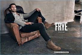
For over 150 years, Frye’s iconic boots have defined eras, embodied social movements, and been proudly worn by the confident and courageous. With a legacy of unrivaled quality and craftsmanship, Frye captures the essence of timeless American style.With a heritage rooted in craftsmanship, Frye awakens the curious, the courageous, and the adventurous in all of us.
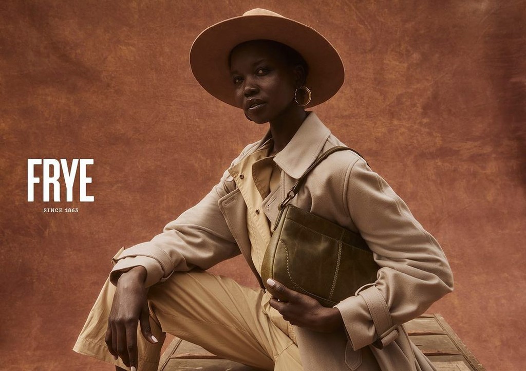
Frye Supply is a diffusion line of Frye, focused on workwear fashion and footwear.
The target audience broadens into a younger generation who are working but are unable to spend on high-end luxury items. I found inspiration in the band behind 'Supply' to create a dynamic brand language. By introducing a new font for 'Supply' and incorporating the invigorating color orange, symbolizing enthusiasm and warmth, the refreshed logo retains the cherished identity of the Frye Company. Balancing tradition and modernity, this design ensures a timeless refreshment while maintaining the brand's enduring legacy.

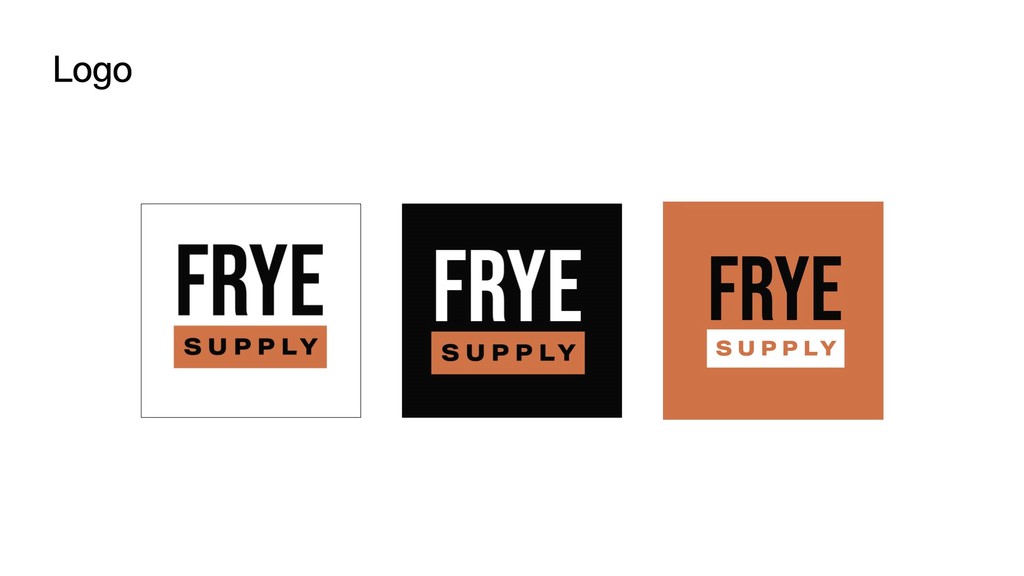
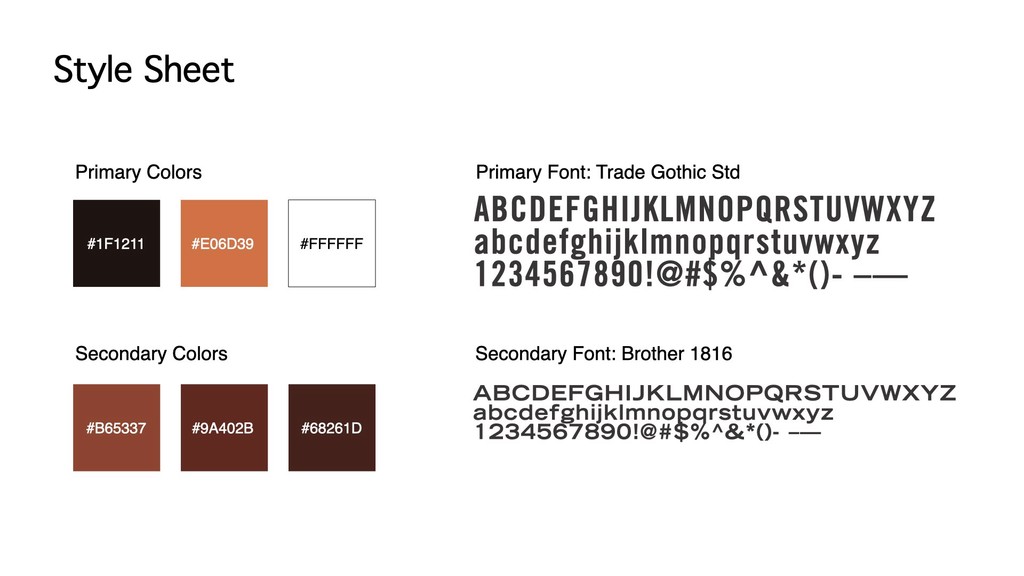

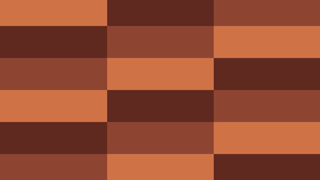
Drawing inspiration from the timeless appeal of classic American style, the visual design language centers around warm colors that evoke a sense of familiarity and heritage. By incorporating a diverse range of colors,I aim to infuse depth and richness. Moreover, the use of the band creates interlocking pa#erns, representing not only the supply chain but also symbolizing the close-knit community
at Frye Supply.